Force Majeure
A few images as a reference points. Just as visual ideas, not to be taken too literally.
Albers' square. Thinking about structure, not as distinct zones but as a something that has three interrelated spaces.
The tiny (9.2 x 6.2 cm) Hours of Jeanne d'Evereaux have a secondary narrative in the margins.
The Egerton Genesis at the British Library is another favourite. Amazing line drawings and these repetitive images.
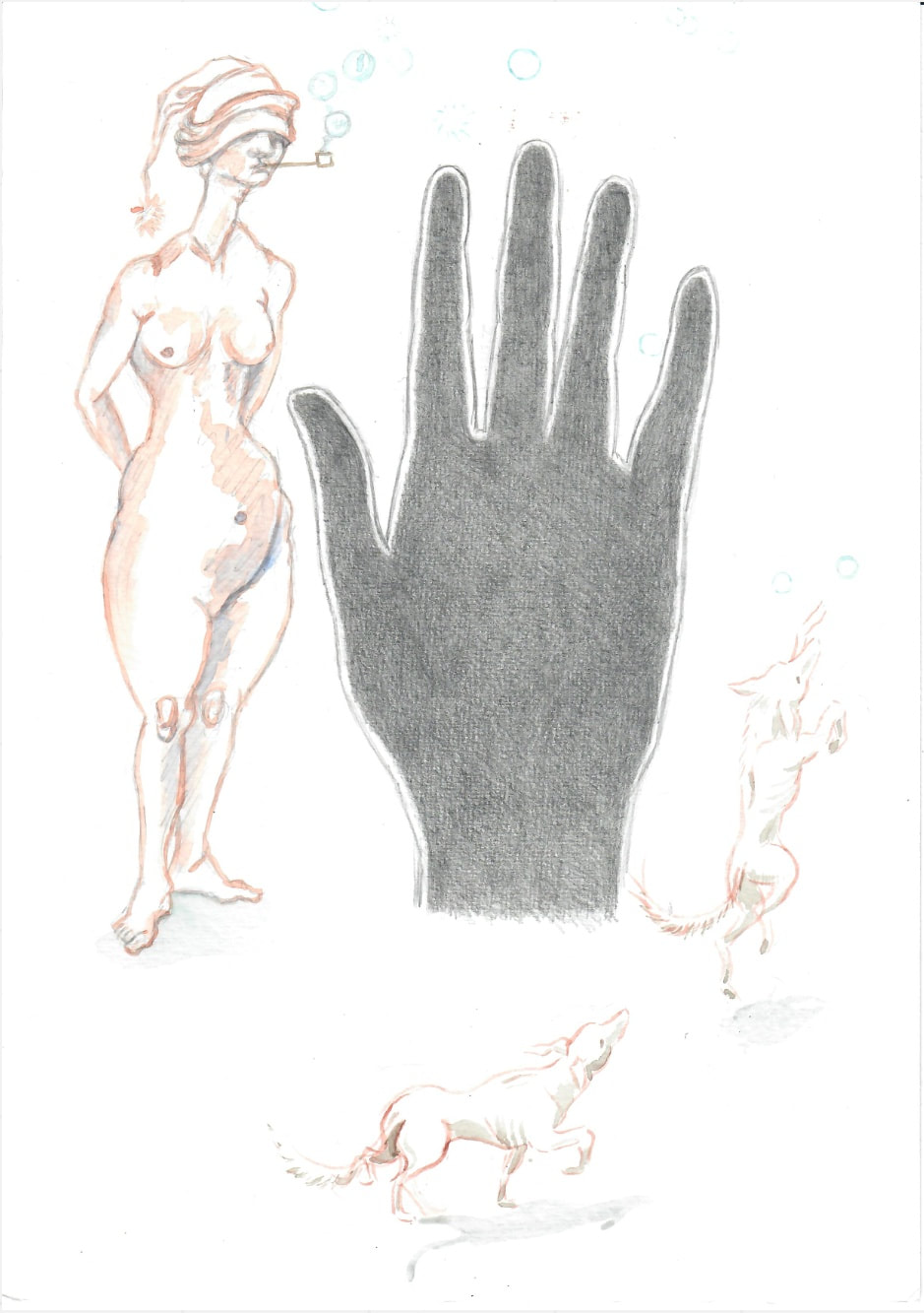
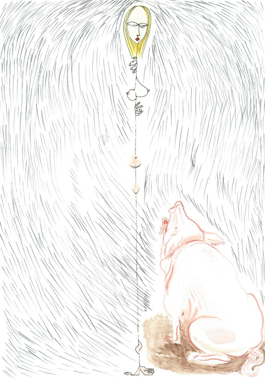
And one of the surrealist Cadaver Exquis.
I love the hole in the giant foot.
Normally a dog or a lion in this spot but a wild man in this one.
And one of the surrealist Cadaver Exquis.
I love the hole in the giant foot.
Normally a dog or a lion in this spot but a wild man in this one.
A strange creature from a Misericordia.
Writing on a shard of pottery.
Japanese Yokai illustrations, the brushwork is very special.
We share a few areas of interest but do quite different things with these.
Writing on a shard of pottery.
Japanese Yokai illustrations, the brushwork is very special.
We share a few areas of interest but do quite different things with these.
Comic book pages by Jacovitti, who had a very anarchic style and was also very playful with the language used. I love his little "all over" vignettes with which he fills all parts of the page. He called these his 'fillers' (the little drawings that are not
part of the main action) and that he didn't like empty space.
part of the main action) and that he didn't like empty space.
The other images are of those oddities, to our eyes perhaps, in medieval and Renaissance art. Plus the colouring of the African mask.
So varied, they open everything up stylistically. What a miserable looking lion.
I will add a couple more from two artists who are on the cartoon and art borders: Simone Lia and Janette Paris. Janetta’s plank has no character and is continually placed in situations which you expect an emotional response.
I love these, especially the humour level they hit. I'm just thinking that the square of the strip format links with the Albers.
I still remember with great jealousy the Hokusai Manga books.
A counterpoint to the baroque Jacovitti is a painting by the Japenese painter Hasegawa Tōhaku using the concept of ma. Leaving negative spaces to say things and for the imagination of the viewer to add something of their own.
I still remember with great jealousy the Hokusai Manga books.
A counterpoint to the baroque Jacovitti is a painting by the Japenese painter Hasegawa Tōhaku using the concept of ma. Leaving negative spaces to say things and for the imagination of the viewer to add something of their own.
One option for paper, it is very slightly textured but pressed and 'smooth' and 300gsm so a bit heavier. Cass (and others) do a 200gsm A4 heavy cartridge which is even smoother and good for light watercolour and ink wetting. It is cheaper but lighter.
The 300gsm is much better for water colour but sometimes the cartridge is better with pen and ink.
I’ve been working on the 200gsm cartridge for the last 5 months. It is good for drawing and ink and watercolour but it does buckle with washes. I don’t really mind this. It is also completely smooth. I’m easy either way and can find dryer options although I will use watercolour brushed line for drawing. I will try out the 300gsm in the next few days and let you know how it feels.
I made some Cadavre Exquis with a friend and my son using the Cass 300gsm paper. We used pencil, conte, ink, crayon and washes. It held up well so I think this would be a good choice for us.
We have another week to go until we start the drawing process. I was wondering whether we need any kind of underlying structure or format to the pages. It could be there but disregarded and transgressed. Or we can just work organically and responsively each time. What do both of you think.
Could we set up a weekly timetable so that it becomes a pattern. Something like:
Mon - Thurs: draw
Friday: post on work
Hopefully this will arrive by Monday to start again.
It would be good to take interim photos or scans before posting.
Could we set up a weekly timetable so that it becomes a pattern. Something like:
Mon - Thurs: draw
Friday: post on work
Hopefully this will arrive by Monday to start again.
It would be good to take interim photos or scans before posting.
I'm wondering if we should follow our own structure but be very open to transgress as well as build on top of each other's work. I was just looking at the cathedral and remembered how these places are designed like illuminated scripts and completed by many craftsmen and what we'd now call designers. I thought we could use a structure of sorts where we all design a central scene and post to the next who will do the frame.
I like the cathedral reference, it is analogous to illumination but more collaborative. For me cathedrals are spaces which tried to find ways to represent the whole known universe. And as with the misericords there were additions in the margins which intervened into this sense of order. I am happy working with blank pages or a structure. Maybe you could send a template which can be used as a starting point to be kept in the back of our mind or simply ignored.
I don’t think we need to stick to a structure but if we are using a structure it is better to be using the same one. We each get to choose the starting points for our own drawings.
Let’s keep it loose and see where the drawings take us.
Let’s keep it loose and see where the drawings take us.